2024
Optimizing OKX's deposit experience
Incorporate data insights to drive IA reorganization that led to significant conversion rate improvements.
- Client
- OKX
- Role
- Product designer
- Stakeholder
- 2*PM | 1*Web dev | 1*Customer service
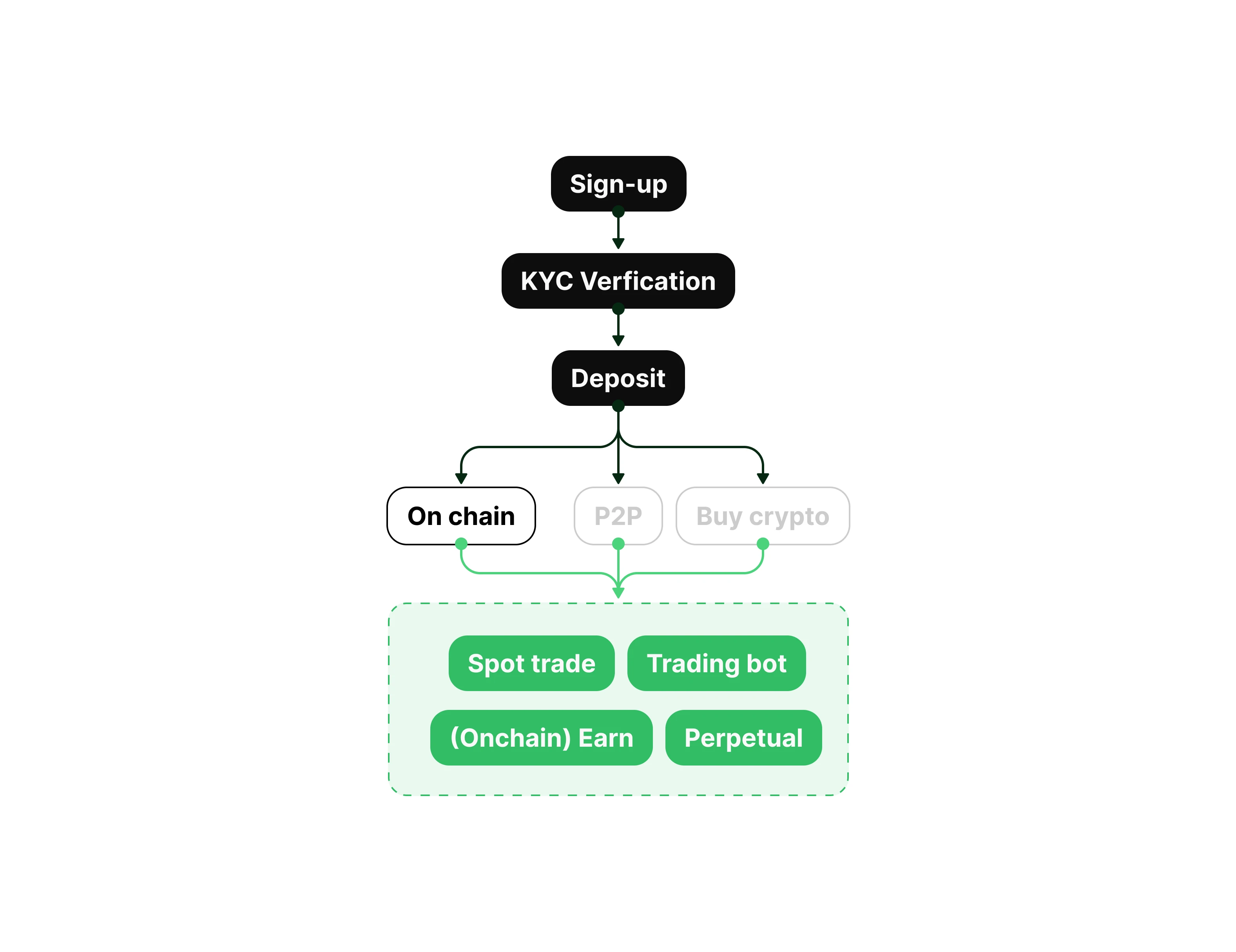
Deposit facilitates platform growth
Deposit serves as a core function within the app, also the very first touch point before users get access to multiple trading instruments and earning activities. Creating a seamless deposit experience is considered as the first priority to drive platform growth.
Friction in a high-anxiety decision process
Data from Amplitude revealed a significant conversion gap: our web platform had a conversion rate of only 36.0%, with users taking an average of 25 seconds to complete a deposit. Which is significantly higher than the app platform.
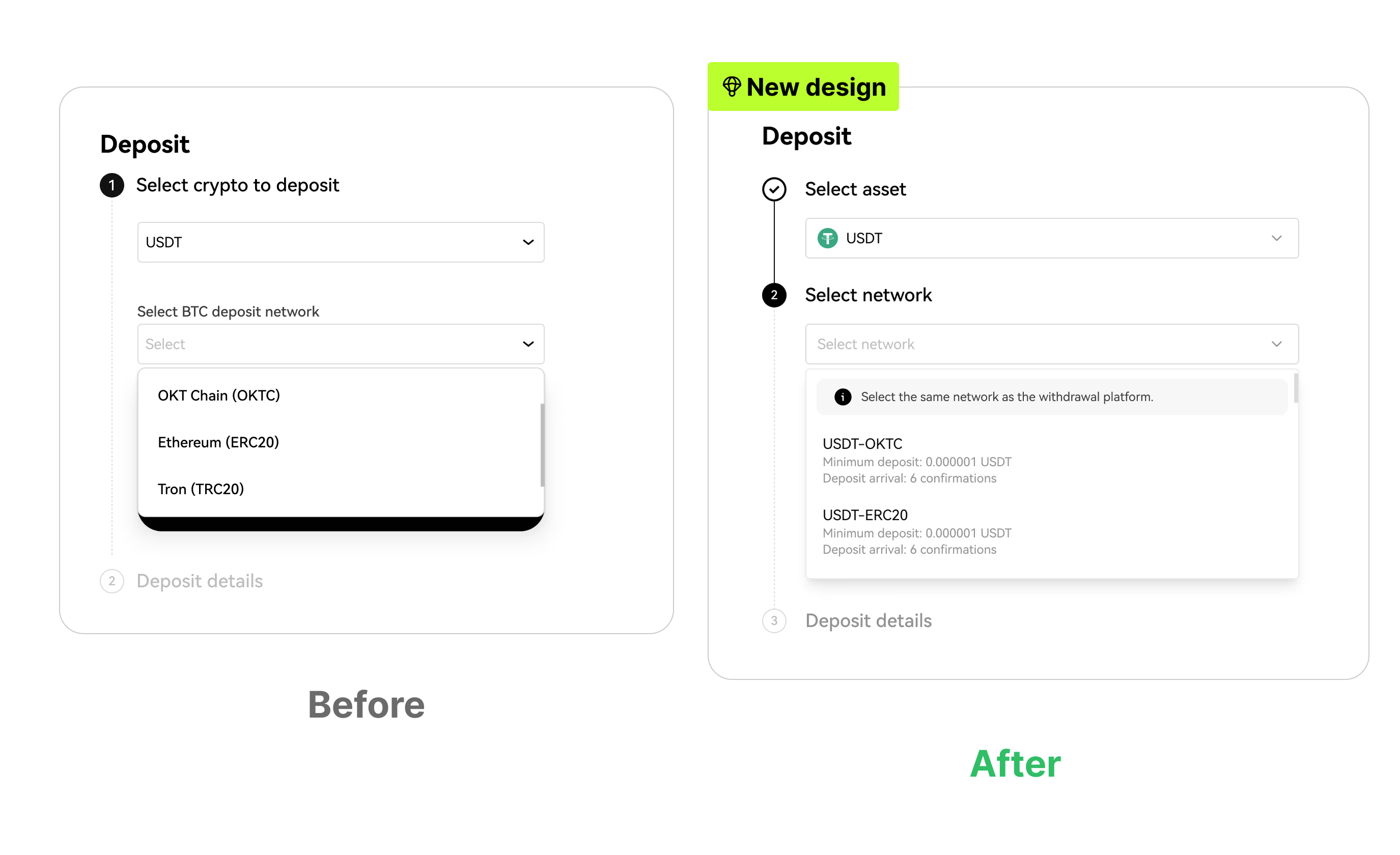
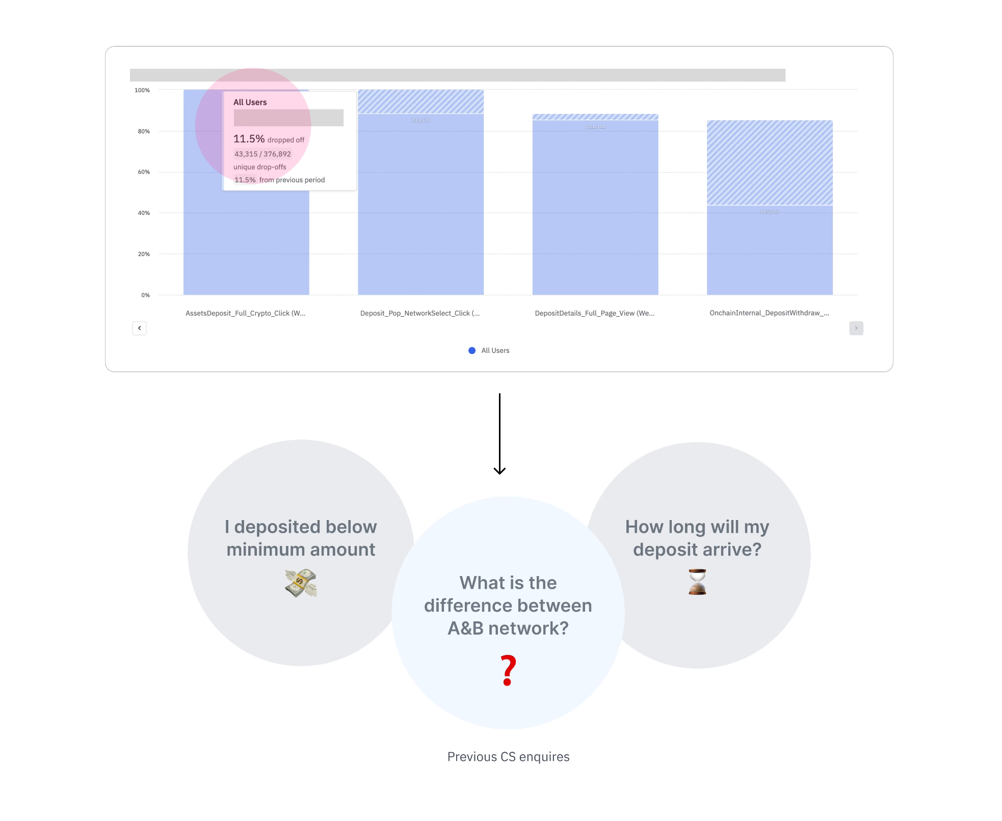
Getting lost during network selection
We lost around 10% of users during the network selection, and checking the CS portal, there's a significant number of inquiries that reveals the fact that users are not familiar with the differences in between different networks.
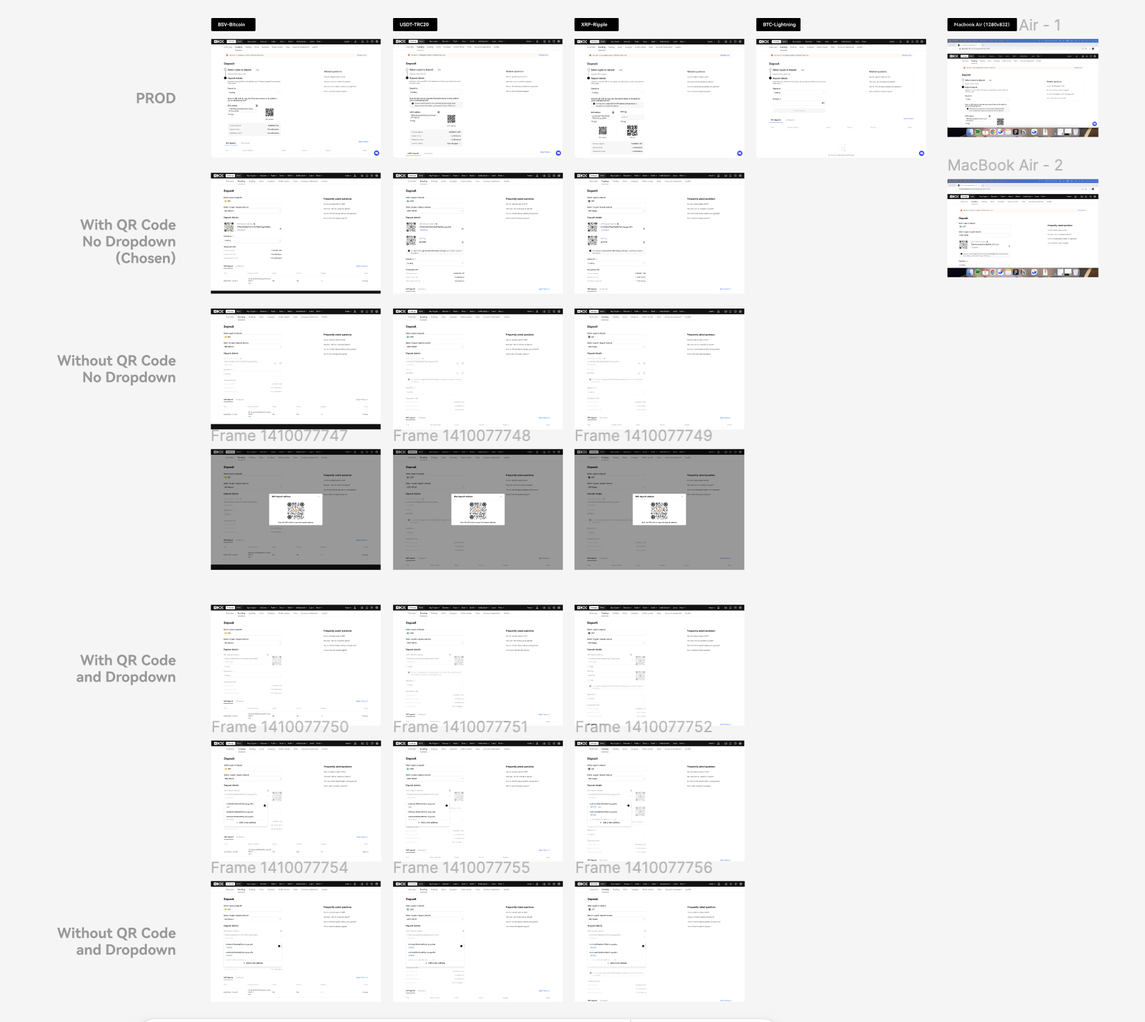
Re-work on the deposit content structure
- User flow -> Worked hand in hand with content designer to reduce information complexity (reminders and pop ups), simplifying the process for users to reach their own address.
- Deposit detail page -> Rearrange Information architecture based on its CTR, guide users to put more attention on actionable items.
Design outcome
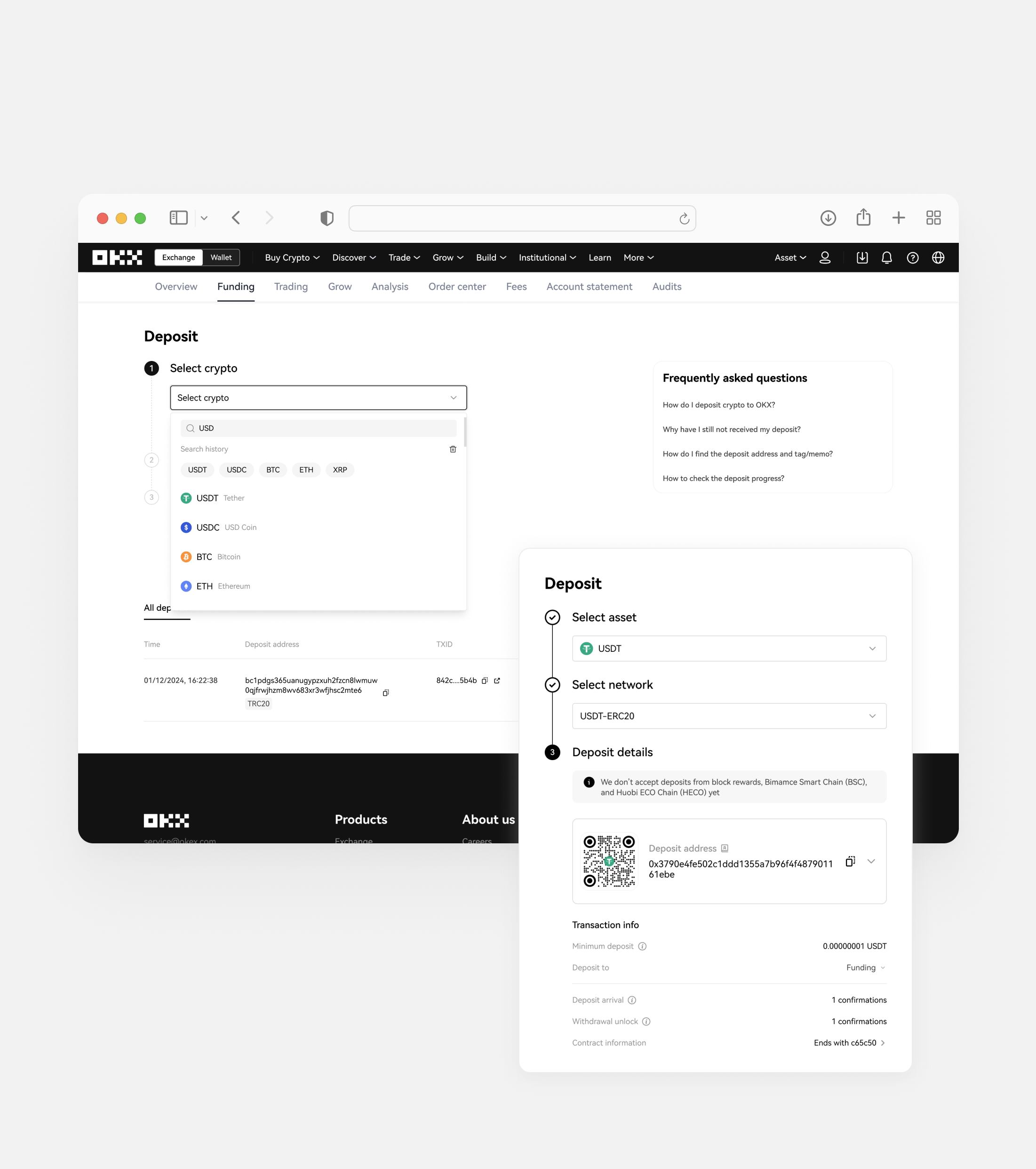
- Minimizing noise -> Removed 3 redundant reminders and 1 unnecessary extra click.
- Emphasis on copy address action -> Reorganized the layout to lead visual focus to deposit address which has a 70% CTR.
- Network dropdown optimization -> Optimized the network UI to display min. deposit and deposit time, leading to a 30% drop in CS inquiries by providing users with key info upfront.